The site is optimised for mobile and tablet use – it’s inconceivable for any website in 2018 not to be. So I decided to put VisitTheUSA through its paces on my iPhone, as a sneaky extra test of the ‘intuitiveness’ of the user interaction, as I have – up until the last couple of weeks – been an Android user for the last nine years.
First impressions
After punching VisitTheUSA.com/TravelTrade into Google, I was promptly taken to the mobile website. Which, Brand USA will be glad to know, loaded wonderfully quickly without any wait time. The opening screen is a clean orange and white interface which to urges to me to visit the USA – as it should.

What you can’t see in the above image is the seven white dots of a carousel / rolling display for swiping to other content, which works pretty well – but I did have to swipe more than once a couple of times. Is that down to me and my aging fingers or is Brand USA at fault? I tried a few other sites to see if I had the same issue but most mobile sites, the ones I frequent anyway, don’t have a carousel, so I am giving VisitTheUSA the benefit of the doubt on this one.
Trip planner
As suggested, I took the home page’s advice to “Try the new USA Trip Planner” and clicked on view more which took me to ‘Trending destinations’:


I chose New York, and intuitively pressed down on the image of the Big Apple. Much to my expectation, I was taken to the ‘New York City Trip Planner’; from there it was a matter of selecting from ‘Best things to do in New York’. There are six different types of excursion, categorised as popular, museums, hidden gems, parks, side trips and shopping.
Delving into ‘popular’ I counted 30 different locations, all of which break down into a seemingly endless number of ideas, all backed up with a nicely written description, pictures, trip information and a collection of reviews from TripAdvisor and Google.
I also received a prompt to ‘Create a full itinerary – for free’. This is a glorious section of the website to scroll through, full of interesting sights and attractions rounded out with appropriate and useful information.
Travel advice
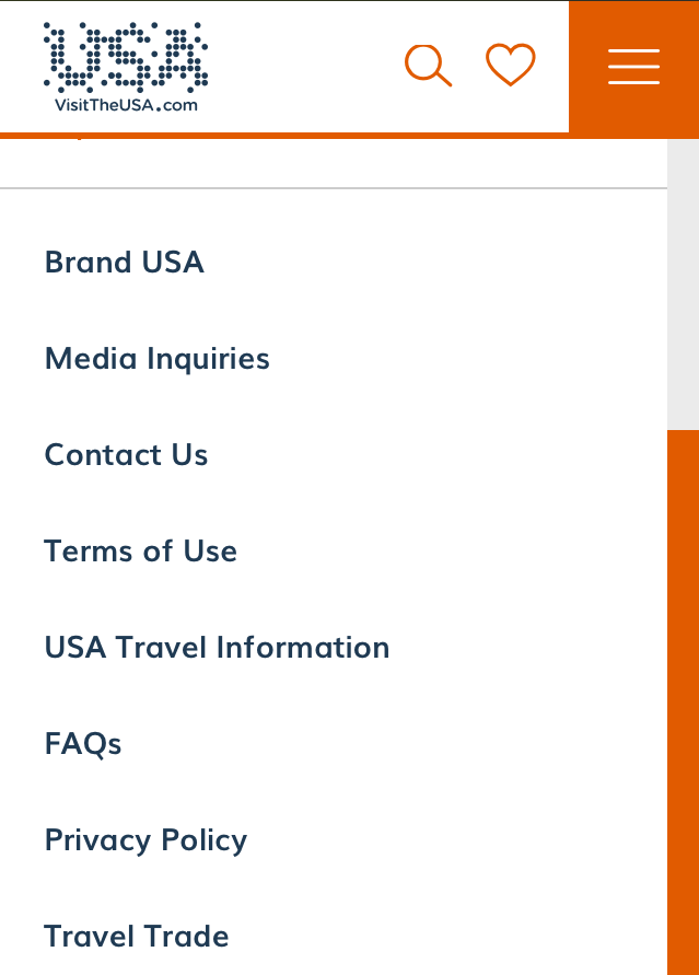
Next up was the promise of information and advice for visiting the USA, including travel policies. I found that easily enough, in the top right hand menu found on all the pages. It was here that I encountered a few problems with the UI, however – that is, I would select USA Travel Information and Contact Us would open up. They might be close together but my fingers are not that chunky that I would repeatedly hit a menu item two notches away.

However, once there, I was presented with a travel update section supported by links to governmental departments such as US Customs and Border Protection and US State Department. This was very useful but with the volatile nature of the USA’s travel policies at the moment. I was not totally convinced this was up to date – which would make me go and do my own research anyway.

Travel trade
The final section I dug into was Travel Trade, crafted to give agents the resources needed to build their knowledge and become a US travel expert. This is another superb part of the website, bursting with options on travelling to the USA, visa and entry policies, domestic transportation. You can also view videos, research MICE activities and bone up on a list of receptive tour operators. You can see the list below:

Conclusion
Travel agency online travel tools are generally poorly executed, template driven canned elearning. VisitTheUSA makes good on its vision to bring a range of resources into one website.
Brand USA has set a new benchmark for trade education and engagement.
I am impressed with the number of listings for trips, experiences and getaways. I could lose myself for hours planning vacations and building itineraries. I will become a US travel expert by accident working my way through this thoughtfully constructed, interesting and useful platform. Brand USA has set a new benchmark for trade education and engagement.


