
With Klook, the new kid on the tour-booking block, raising 60 million USD in funding at the end of 2017 , the popular Hong Kong based company has started making waves beyond Asia, and into the world at large.
The startling amount of money raised by Klook, in the few years since its inception has placed them squarely in the public eye, prompting the question: how does this upstart start-up compare against two of the hospitality industry’s stalwart Viatour and the home sharing giant Airbnb's Experiences offering.
First some ground rules. For the sake of fairness and accuracy I will book the same kind of tour with all three apps; for the purpose of this review, I am going to indulge my passion for cycling and sign up to a two-wheeled exploration of Bangkok. I'll compare the UX, UI and content of each app.
Viator
I found the app online in the amount of time it takes to type Viator and hit enter. But, I was confused by the screen layout, which stated where the location of where I was searching and would I like to change. But I couldn’t see directly how to search for a type of activity.
After maybe a minute of pushing buttons and staring blankly, my mind caught up with the app and I realised where I had gone wrong and punched in my search.
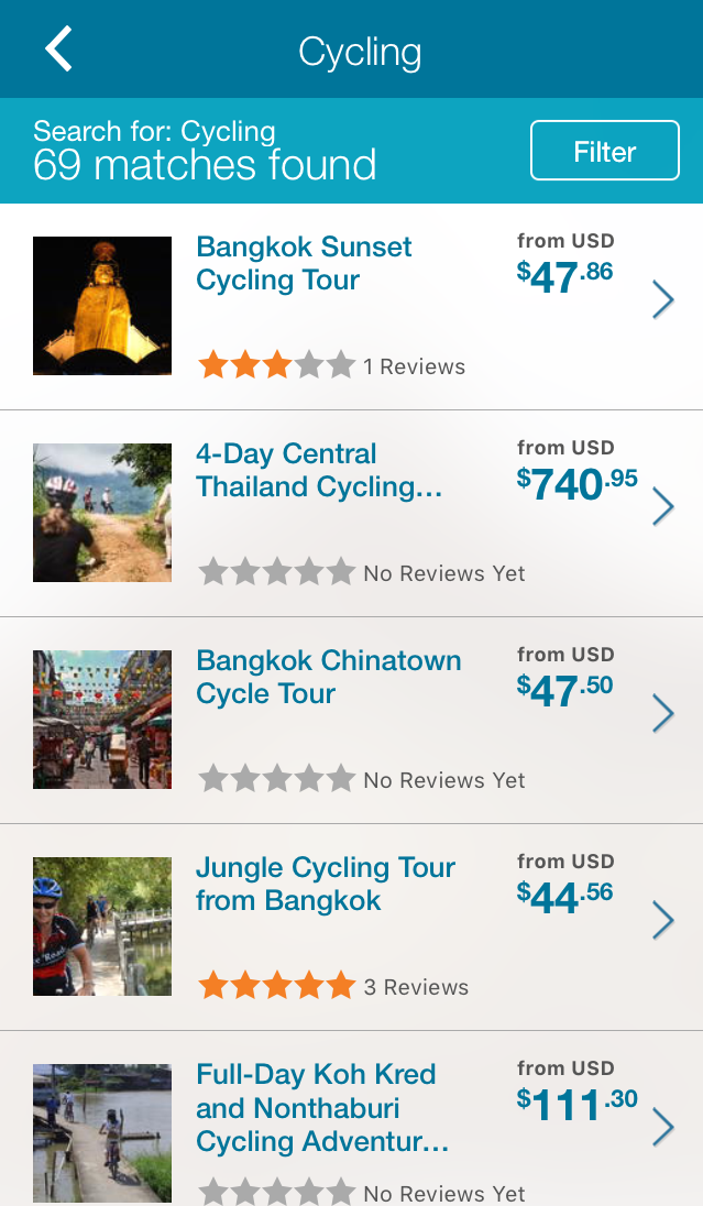
Viator was able to come up with 69 different options; from there I could filter the options as 'attraction’ or 'activity', and by choosing 'activity' my selection was reduced to 68.
These activities were all relevant and of interest to me, but I was frustrated by the dearth of categories in the filter. I would have like to have searched by price – low to high, because I’m cheap – and by user rating, but neither of these were available.
Instead they were laid out, seemingly, at random, with a tour for US$47 followed by one for US$740, then 47 again and then 111. Playing safe, I chose the Bangkok Sunset Cycling Tour, first on the list, with one three-star review, for USD$47.96
The Viator booking page was self-explanatory, featuring an overview of the tour described as a “gentle 17km afternoon ride through Bangkok’s alleyways" followed by information on how long the tour would last and whether or not it includes drinks and snacks. It did, score!
The pricing menu consisted of two pages letting me know the tour was US$47 and details on the language options for the tour (i.e. if your guide speaks your language or if there is an audio recording available), which is a perplexing section to put such info, and the last place I would look if I wanted to know such a thing.
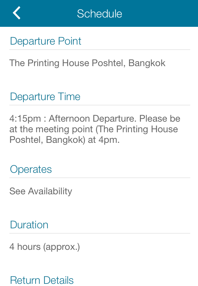
The schedule information was concise and to the point with departure time, location, duration and finish point communicated clearly, but details were thin on the ground. Booking itself was simple, just the number of tourists and the date of the excursion. Checkout is a standard payment screen, capturing billing details and letting you know an email receipt is on its way.
Airbnb Experiences
I have to say I did not like the Airbnb Experiences 'experience' from the get-go. It was easy enough to find and locate the app online and install but, when I went to sign into my existing account the app did not recognise my details.
The app declared there was a problem with my account (there isn’t) and I would have to wait 48 hours for the issue to be resolved. Whatever it was, it had no effect when I used the full site.
So, I quickly made a new account by signing in with social media and got on with booking. The thing that bugs me most about this app is that I am unable to just search for the type of tour I want.
Airbnb fans will know the app directs you to choose from Homes, Experiences and Restaurants. Opting for Experiences allows you to choose from titles such as Classes and Workshops, Concerts, Arts, Food & Drink, etc, with cycling coming under Sports.
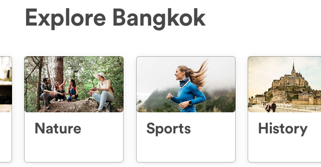
I guess it is intuitive to follow, but I feel like I am not fully in control of my search, which made me think I was missing out on a cycling experience hidden under another category, and should I search all the others before I continue?
I did and there wasn’t. And, the total cycling experiences available in BKK, amounts to five, at the time of booking. Like Viator I was unable to filter tours by price, in fact the only filters I could see were for multi-day 'Immersions’ or two-hour 'Experiences’.
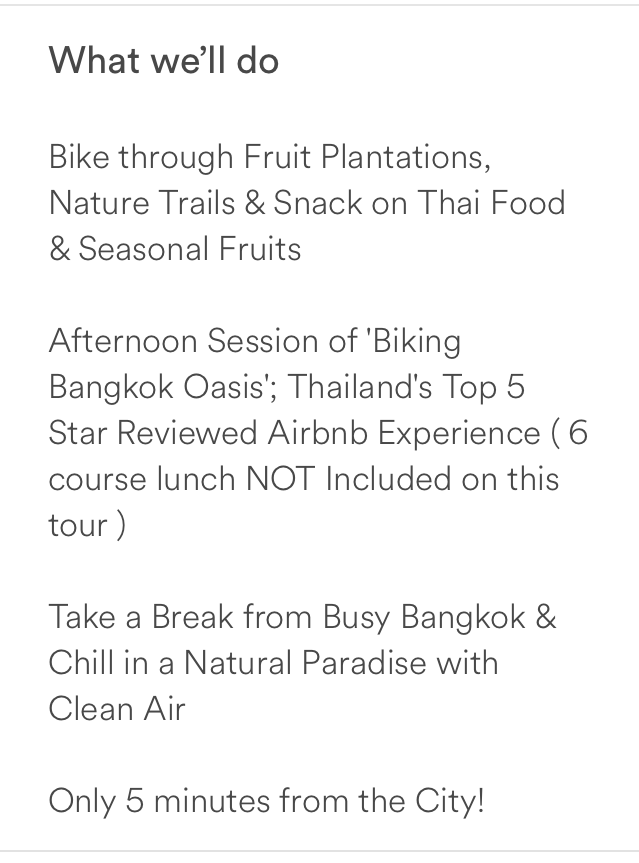
I selected ‘Afternoon Biking Bangkok Oasis’ for $USD44. The information pages on Airbnb are far superior to Viator, giving you a brief intro to the host, in this case Paul, with a synopsis of the tour.
Airbnb is far less stuffy in its approach to content with all the information presented in a nice conversational style, as opposed to the more sombre and stuffy style of Viator. Which, though functionally no different, does make for friendlier interaction.
Klook
The time had come to put the new guy through the ringer and see how he emerges. I am not sure how I feel about Klook. The app makes use of categories like Airbnb Experiences but you can also perform a direct search like Viator, which is a definite thumbs up.
The look and feel of the application is not much different from Airbnb and with only five Bangkok rides, it has similar results.
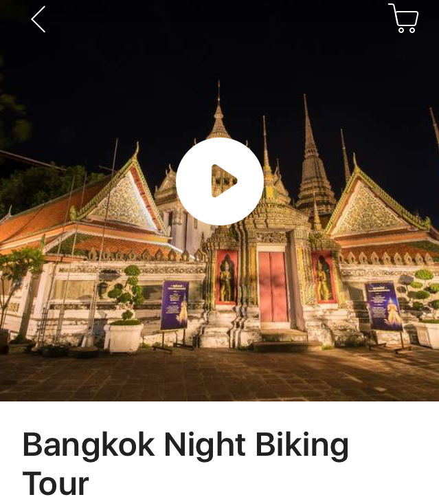
Once I had landed on the Bangkok Sunset Bike Ride (US$52) as my tour of choice I learned why Klook is making waves in the industry.
On top of the easy user interface and modern design Klook provide a wealth of information on all their trips; Bangkok Sunset Bike Ride entry featured a charming mini-video, useful information, star rated reviews, detailed meeting instructions with a map and lots of nice photos, all on the same page. Plus, I could filter tours on price!
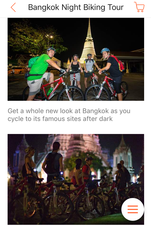
It was only on reaching payment that I found an issue. I had to book a minimum of two people on the tour, which was not a prerequisite of Viator or Airbnb Experiences.
Verdict

Klook co-founders -- Bernie Xiong, Ethan Lin and Eric Gnock Fah
The Battle:
Viator UI/UX feels old fashioned and is clunky to use. It excels in content dept - for examples it returned 69 results for a bike tour inquiry which put the other two in the shade.
Airbnb Experiences is simple and relatively easy to use, with a downmark for search function capability. Signing in to my account on the mobile app was problematic which slowed my research down by ten minutes or so.
Klook smashed it from a UI/UX perspective leaving competitors far behind. It's the easiest to use and unmatched in the tour description depth and detail. One shortcoming for me with Klook's offering is the requirement for a two person minimum on all tours.
My winner? It’s close match between Viator for size of inventory, and Klook for overall user experience but the win goes to Klook. It's a fun to use, inspirational and feels how an activity booking app should feel.


