Delta launches new flight map designed for accessibility

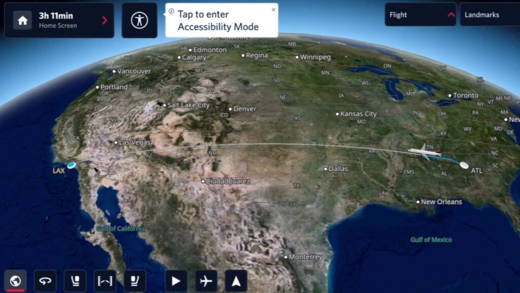
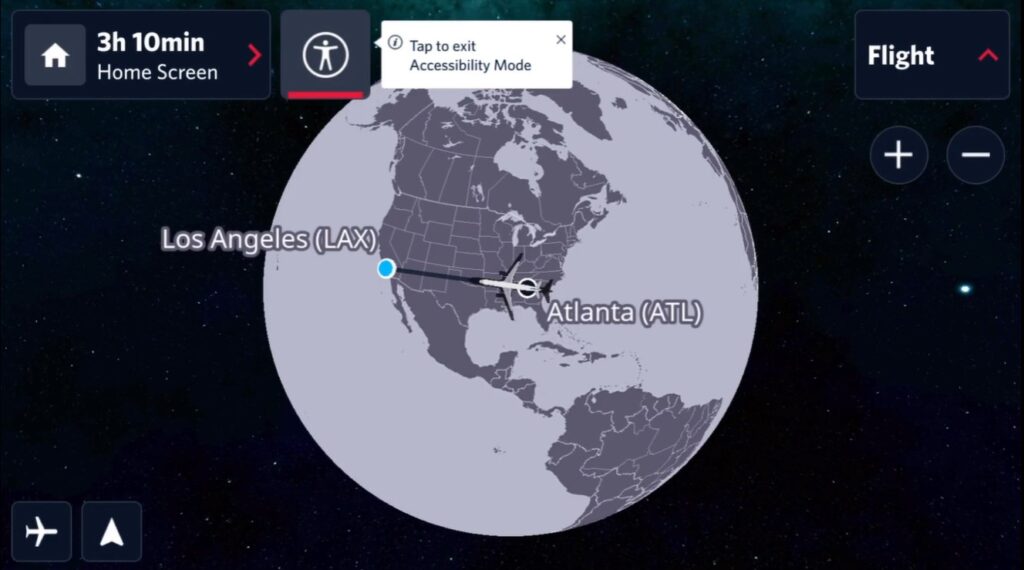
Delta is bringing a new, more accessible flight map to most of its 165,000 seatback screens—the most in the industry—making the beloved moving map experience more accessible than ever. The new flight map prioritizes accessibility while continuing to provide the key features customers know, love and expect. Its high-contrast display and features are designed specifically with travellers with low-vision disabilities in mind. The enhanced product ensures that even more customers are empowered to experience the flight map effortlessly and independently.
“No one better connects the world than Delta,” says Ekrem Dimbiloglu, Managing Director of Customer Experience – In-Flight Entertainment, Delta Studio and Wi-Fi. “To truly fulfill that promise, we must ensure every customer can connect with their journey in a way that enhances their experience and makes them feel valued and cared for. We are proud to be the first airline to launch this technology, setting the standard for inclusive travel experiences across the industry.”
For countless travelers, Delta’s flight map is a beloved part of the in-flight entertainment experience—it’s an opportunity to immerse themselves in their journey while embracing mindfulness through the calming details of the moving map. Delta’s new flight map demonstrates the airline’s understanding of the importance of making this experience accessible.

Delivering a world-class experience to all travellers
Delta’s commitment to accessibility is rooted in its belief that travel is for everyone. Already an industry leader with 100% closed captioning on all movies and series content and a 40% increase in audio descriptive content in the last year, Delta continues to seek ways to make travel more accessible.
While its flight map was already built to meet all Americans with Disabilities Act (ADA) and European Accessibility Act (EAA) standards, Delta saw an opportunity to push further. Alongside inflight map provider FlightPath3D, the airline collaborated closely with its Advisory Board on Disability, presenting an early version of the map for hands-on testing and feedback that was instrumental in refining the final design and functionality that customers will experience today. This collaborative approach emphasizes the importance of listening, learning and innovating based on the real experiences of those most affected by inclusive design efforts.

“It’s exciting as a visually impaired person that Delta is making the flight map more accessible for low-vision users,” says Thomas Panek, Chair of Delta’s Advisory Board on Disability and President of Guiding Eyes for the Blind. “By making flight maps more accessible to low-vision users, Delta is making the experience better for all travelers.”
Inclusivity as a Core Design Feature
The new flight map is rolling out to customers now on more than 650 aircraft across the airline’s global fleet. Core features include:
- High-Contrast Visuals: Bright colors against dark background or grayscale rendering ensures maximum visibility and reduced eye strain.
- Color Blind Palette: Use of patterns and textures in addition to colors to distinguish different areas and elements on the map.
- Large Text & Icons: All text and iconography is rendered at larger sizes, eliminating the need to squint or strain to make out details.

- Streamlined Information: Clearly labeled map features like countries, borders and major cities are prioritized to reduce clutter and enhance readability.
- Zoom & Pan Controls: Users can zoom in/out and pan around the map view to adjust to their preferred perspective and visual needs.
- Voice Narration (coming in future versions of the accessible map experience): Planned voice narration will leverage AI and flight data to provide audio updates on arrival times, points of interest and more.
Delta knows that the path to a more accessible travel experience is a journey, but the airline is proud to be moving in the right direction.


Comments are closed.